Pretend I am Oprah for a second, and listen to me share one of my favorite things:
FAVICONS.
I love them so much. In fact, since I have started working as a developer the use and importance of a favicon has been the topic I have debated the most. While some people think they are just clutter, I think they showcase a brand and profressionalism.
Unfamiliar with favicons? Well let me tell you what they are.
The word is a combination of favorite and icon. They are tiny little square images that are 16 pixels by 16 pixels. They are not a JPG or a PNG, but an icon file that is saved as an .ico file. They are used as branding / bookmarking on websites. They go next to the title of the webpage if you have a tab open. Like so:

You also may have noticed them here in your bookmarks bar:

The reason I love them is because no matter the web browser, I am a heavy tab-user. I always have at least 8 tabs open with music, email, and projects I am working on. When I am jumping from one tab to another, I am usually just skimming the text because my eye is focused on the favicon.
The virtual space in my life that would most benefit from more favicons is my RSS reader. I personally love using Feedly. If you aren’t familiar with Feedly, it is an RSS feeder that keeps a running list of all your favorite websites. Rather than visiting their actual URL, you can just get their updates streamed into one place. There are several different RSS feeders out there, but the ease of Feedly makes it my favorite, hands-down. I subscribe to all of my favorite blogs and organize them by their categories: friends, traditional design, fabric, web-design, food, and religious.
Here is a little screen shot of what I see when I sign into Feedly.
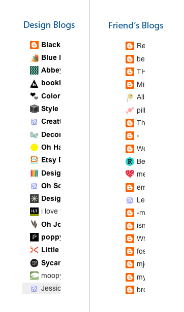
Clearly, my friends folder doesn’t have a lot of personality in the favicon department. The orange favicon is the default created by Google for any blog that is made by Google Blogger (hence the “B” in the favicon).
Last month, I set out to change this. I told my friends that I would make any of them a favicon for free. It could be whatever their hearts desired. A flower, a letter, a picture of your face? You got it. I gave them a little bit of guidance because even though Martha Stewart is powerful enough to have a picture of herself as a favicon, not everyone can pull it off. I showed them some of my favorites:
Because the image is so tiny, it is good to have just a few details in the image but nothing too complicated. Here are some of my favorites:
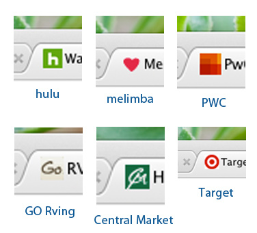
Successful favicons are simple; they are a continuation of the brand in a small space.
- Hulu reversed a little snippet of its familiar logo for their favicon. The green is strong against the common neutral backgrounds of a browser tab.
- Melimba is a lifestyle fabric company and has a heart for a favicon. Although the heart is not part of the logo, it represents warmth – a feeling that the fabrics should bring as well.
- Price Waterhouse Coopers has an intricate logo, but they successfully collapse their look into their favicon space.
- GO Rving redid their website a couple years ago. By taking a small portion of their logo, they named the title of the page so that it purposely works with the favicon. So the title on your browser tab has an image, but still reads “GO RVing.”
- Central Market is a grocery store in Texas. They recently updated their website and elements from the logo were combined to make this favicon.
- And lastly, Target. They have already created an iconic look, which translates perfectly to a powerful favicon.
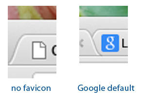
In my opinion, a favicon is one more simple spot to showcase your brand. It’s kind of a big deal if you don’t have one. Depending on your browser, you may get a small replacement favicon that looks like a blank document. In the last few months, Google has taken an interesting tactic with favicons. If you do a Google search and then go to a site from the results, Google will put their default favicon on that found site. If the website has created their own favicon, it will quickly replace the Google default. But if not, Google’s logo will be placed next to the title. Pretty clever there, Google…
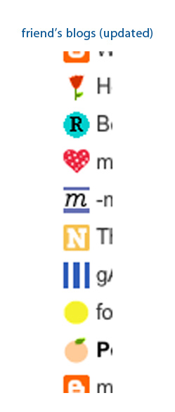
I am happy to report that my friends responded to my plea for a favicon recall. I have created 20 new favicons and my RSS feed couldn’t be more pleased!
Happy favicon day to you!
If you want to see even more, here are a few sites with favicon examples: Smashing Magazine | Sitepoint


